My first style option for the project, still too my favorite. I love the palette and the consistency of this suite.
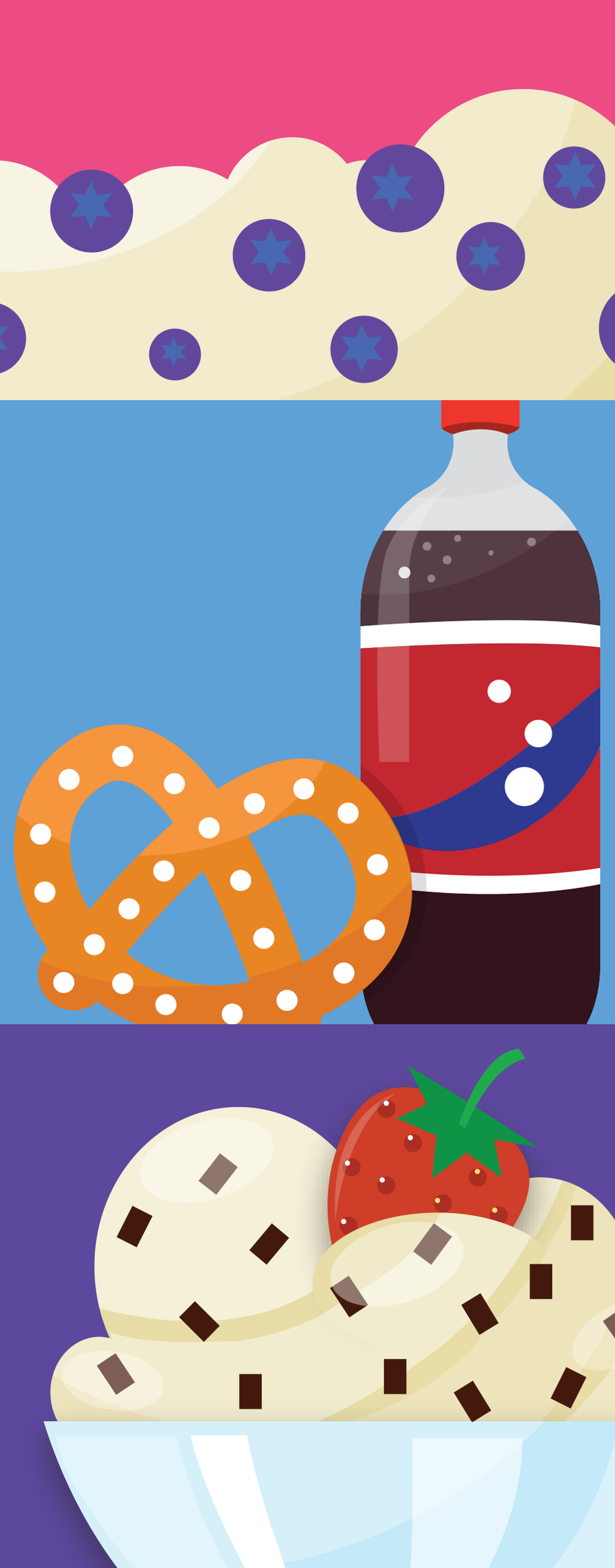
The client wanted more illustrative so the next suite is like spot illustrations.
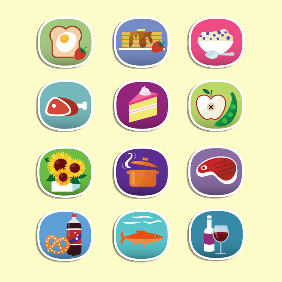
I loved this project. I was commissioned to create store categories for shopping at the grocery chain. These would reside on their Mobile/Tablet apps and potentially the website.
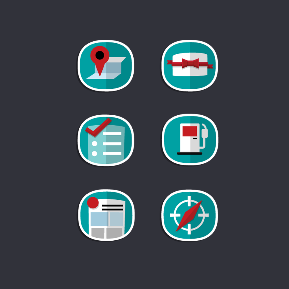
Here are the 'squircle' finalists... icons in the Safeway 'square-circle.'
Additional categories and options for the icon suite.
After delivering the final set of 'squircle' icons, and a change in creative leadership in-house, I was asked to create glyph options for the categories.
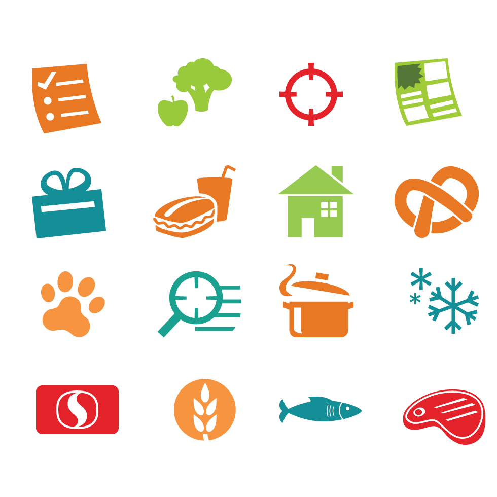
The final, selected icons for Safeway. Web and Mobile.
I did notice that some of the icons I created and others they picked up elements from the 'squircle' icons and made glyphs from them... that resulted in some inconsistencies with spacing and thicknesses, but out of my control.
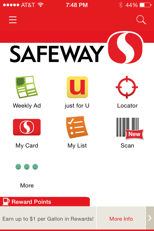
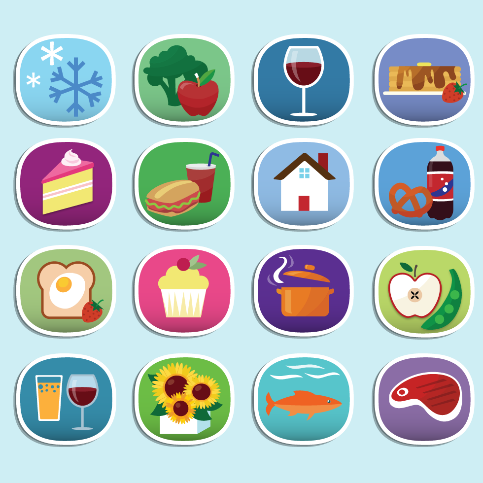
The Safeway icons, mobile.
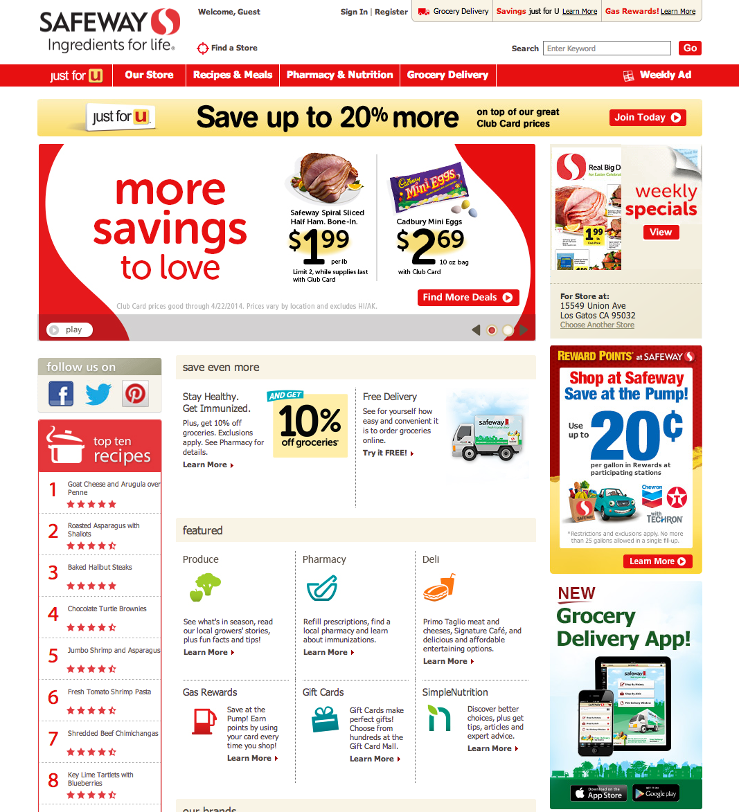
The Safeway icons, web.